Alignment Is the Tell
You can watch the 10-Year all day in isolation and still miss what is happening to it. No market trades by itself — it moves inside a complex: an asset class, a sector, a curve. The related markets around your market of interest carry information about it: they lead it, they lag it, they confirm it, or they warn you. That is confluence — awareness you cannot get from a single chart.
The catch has always been comparability. Two markets, two price scales, two personalities — how do you actually line them up? You put them on the same framework. Each market read within its own PriceMap — the same DIR, UP, DP, Critical Range and Sentiment Bias on every one — and suddenly they are speaking the same language. Now you can read them side by side.
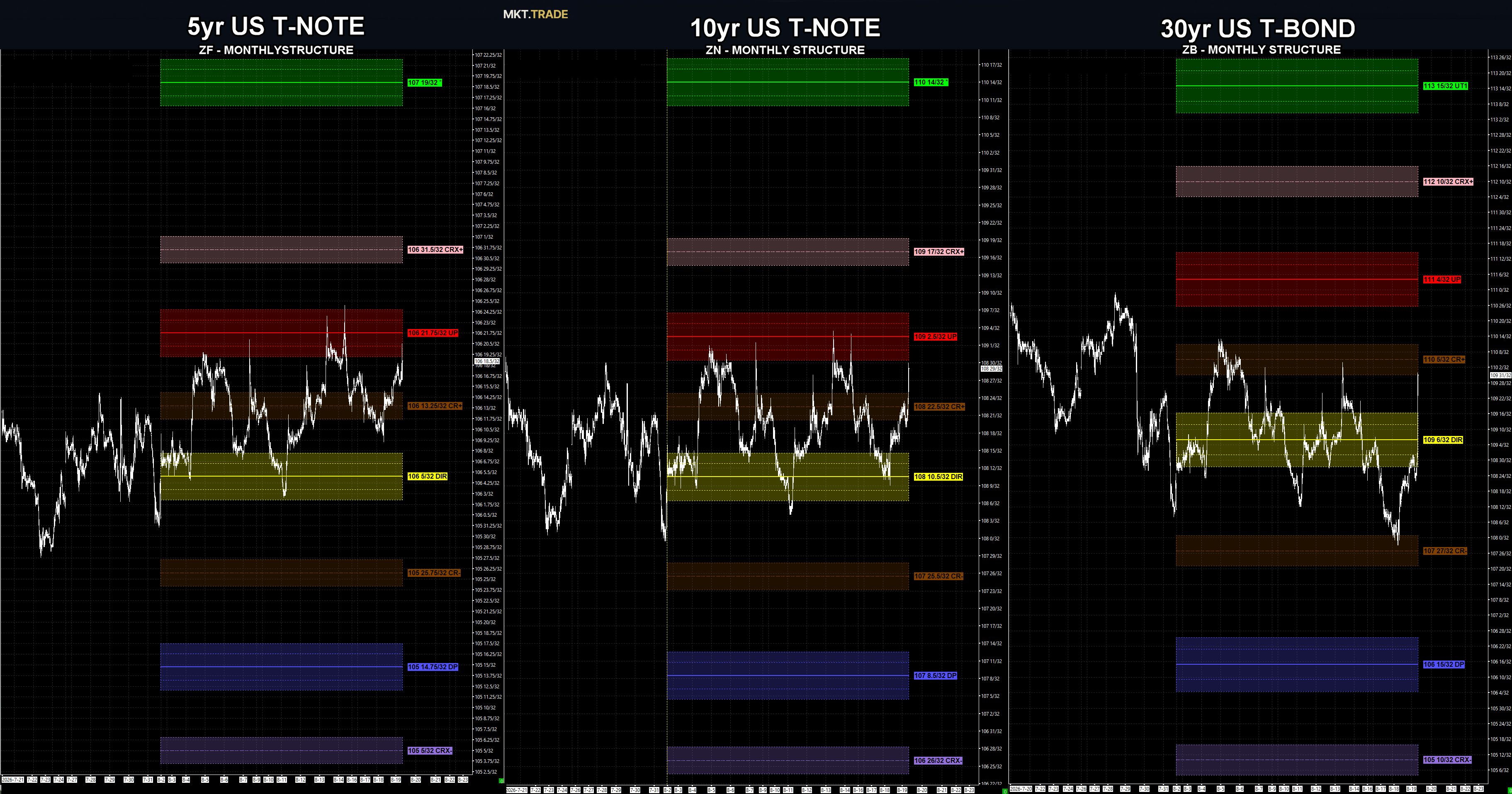
Because each market sits on the same PriceMap, the relationship between them becomes visible. The price structure inside each market’s structure naturally draws the curve — and shows you which market is leading which lean. You are no longer guessing at correlation. You are reading it.
All three markets are digestive right now — none is trending. But the character of that digestion differs, and the difference is the curve.
The 5-Year (ZF) is holding the most constructive plot: a higher-low, higher-high digestion. It is leading the positive lean. The 30-Year (ZB) is the mirror image — a lower-low, lower-high digestion, leading the negative lean. The 10-Year, our focus, sits between them — and it is leaning closer to the 5-Year’s bias than the 30-Year’s. That tilt, read across the curve, is information you would never see on the 10-Year alone.
Here is the confluence. All three markets are trading above their DIR. And on all three, the Sentiment Bias — the R Level — sits above the market. By the definition of this regime structure, trading above the DIR is corrective — a bounce inside a larger bearish context, not a new trend. The Bond, the laggard, is only coming into that alignment this morning, ahead of the FOMC.
Against that backdrop, the 10-Year traded above its 108-22.5 CR+ metric boundary — breaking structure on the active SELL UP FADE and taking back the bulk of that trade’s unrealized gains. What the alignment tells us next: the 5-Year and 10-Year UP (Upside Pivot) is the gateway to a full corrective transition. That transition may extend to the R Level — or it may exhaust earlier, at the CRX+.
The earlier-exhaustion case is real, and the reason is the 30-Year. The Bond is more aligned with going sideways than shifting into a trend. Any positive push in it is likely to exhaust — or at least reject on the first attempt at its UP (111-04). That drag caps how far the whole curve can run. And the line that flips everything: only under the DIR are all three markets back in the Bear Trend.
This is why you read the whole complex. When like markets are in alignment, the picture is clearer and follow-through is more likely — the whole curve is pulling the same way. When they diverge, conditions get harder, because the market is fighting itself. And when like markets are not aligned, that non-alignment is not noise to tune out — it is itself the tell. The divergence is the information.
Read your market. Then read the ones around it. The confluence — or the lack of it — is the awareness.
You can only read a curve this way because every market sits on the same PriceMap. Support and resistance drawn by hand doesn’t compare from one market to the next — objective, named structure does. That is what turns a screen full of correlated charts into a single, readable curve, and tells you which market is leading and which is lying. See how it is built on the PriceMap page →