The Market Trades in Segments
Most traders react to raw price on a screen. Every tick feels like a decision, every pullback feels like the end, every push feels like the move that finally goes. That's not trading — that's absorbing noise and calling it analysis. The market isn't the problem. The problem is having nothing to measure it against.
Here's the operator's premise: the market is always telling you what it wants to do. It moves in segments — an impulse, a pause, another impulse — from one piece of structure to the next. The PriceMap defines those segments for every timeframe. And APMD tells you how big a segment should be. Let's build it one layer at a time.
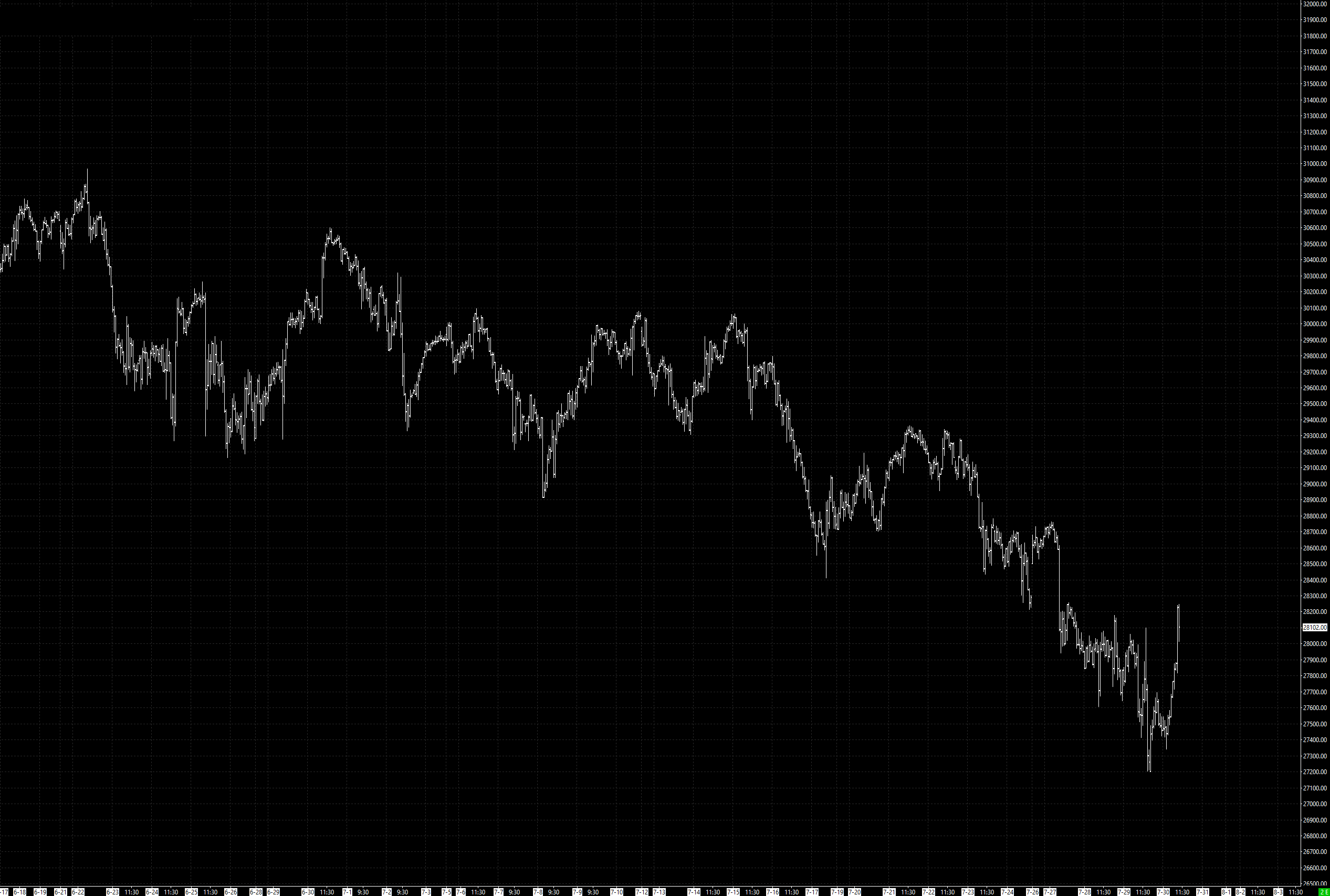
This is price with no reference. It looks like it's doing something, but you can't say what. Is that decline a normal pullback or a breakdown? You have no way to know, because you have nothing to measure the move against. Every bar is a fresh opinion. This is where fear and greed live — in the absence of a benchmark.
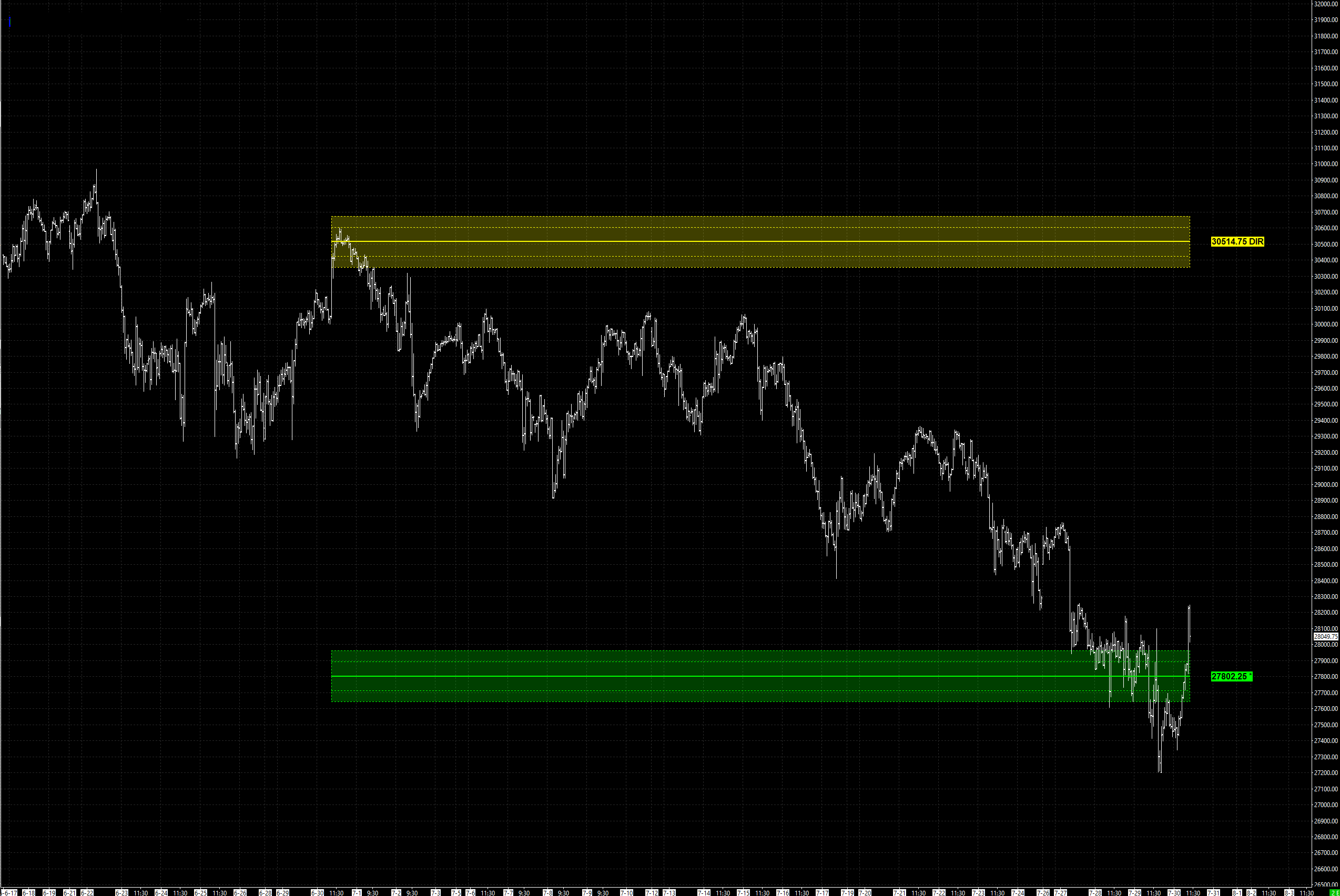
Now we give price a frame of reference. Two anchors go on first. The DIR — the Directional Level — is the market's center of gravity, the level it rotates around and the reference for its directional bias. The R-Level is the sentiment anchor: where price trades relative to R defines whether the tone is constructive or defensive. Two lines, and the same chart suddenly has orientation. Above or below. Constructive or defensive. That is contextual structure.
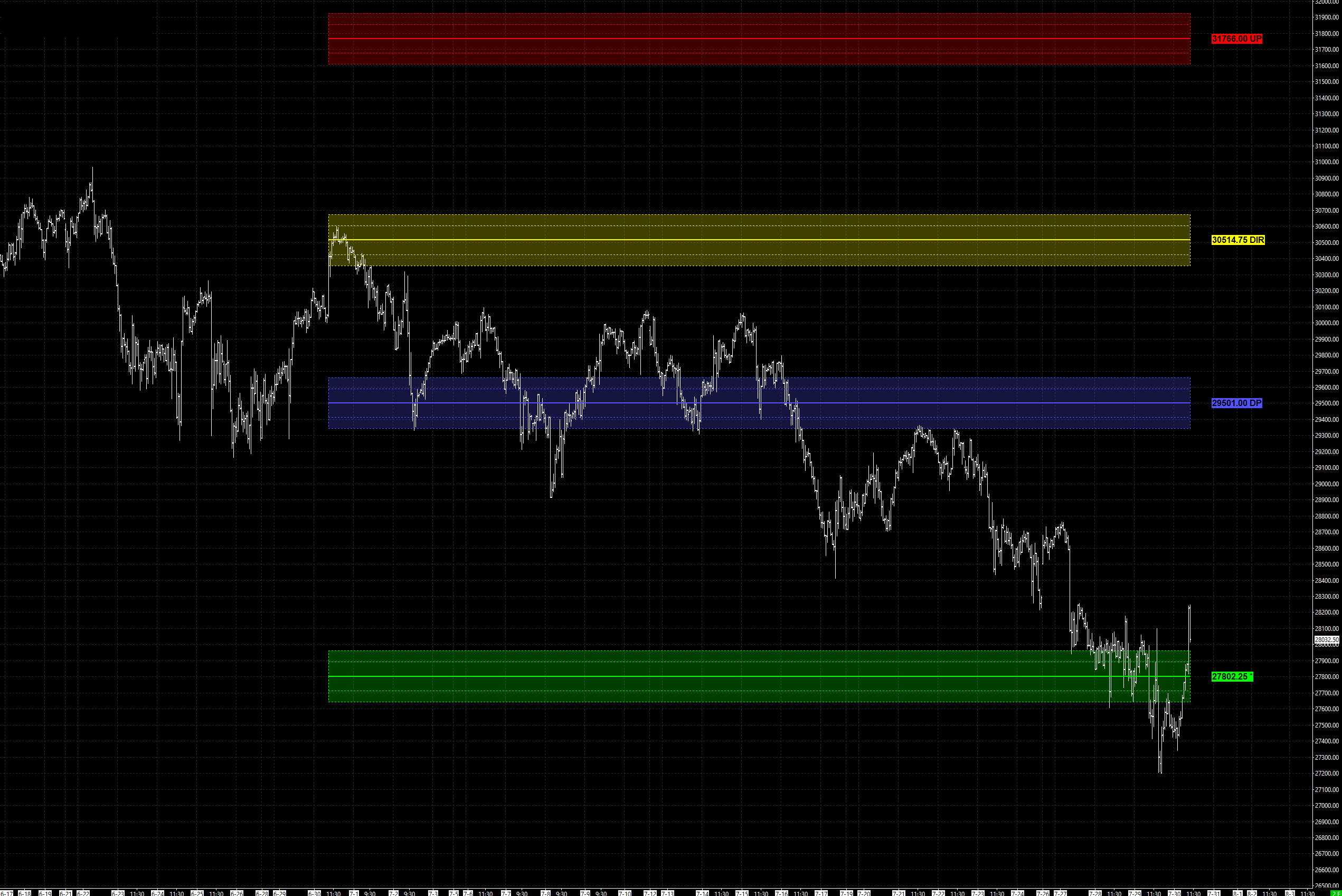
Next, the containment. The UP (upper boundary) and DP (lower boundary) bracket the DIR, and the zone between them is the Critical Range — the neutral zone of the map. Inside it, price is rotational, choppy, mean-reverting and fade-friendly, with a high false-breakout rate. This is where most traders lose money, because inside the Critical Range they mistake noise for signal. Knowing you're inside it is half the battle.
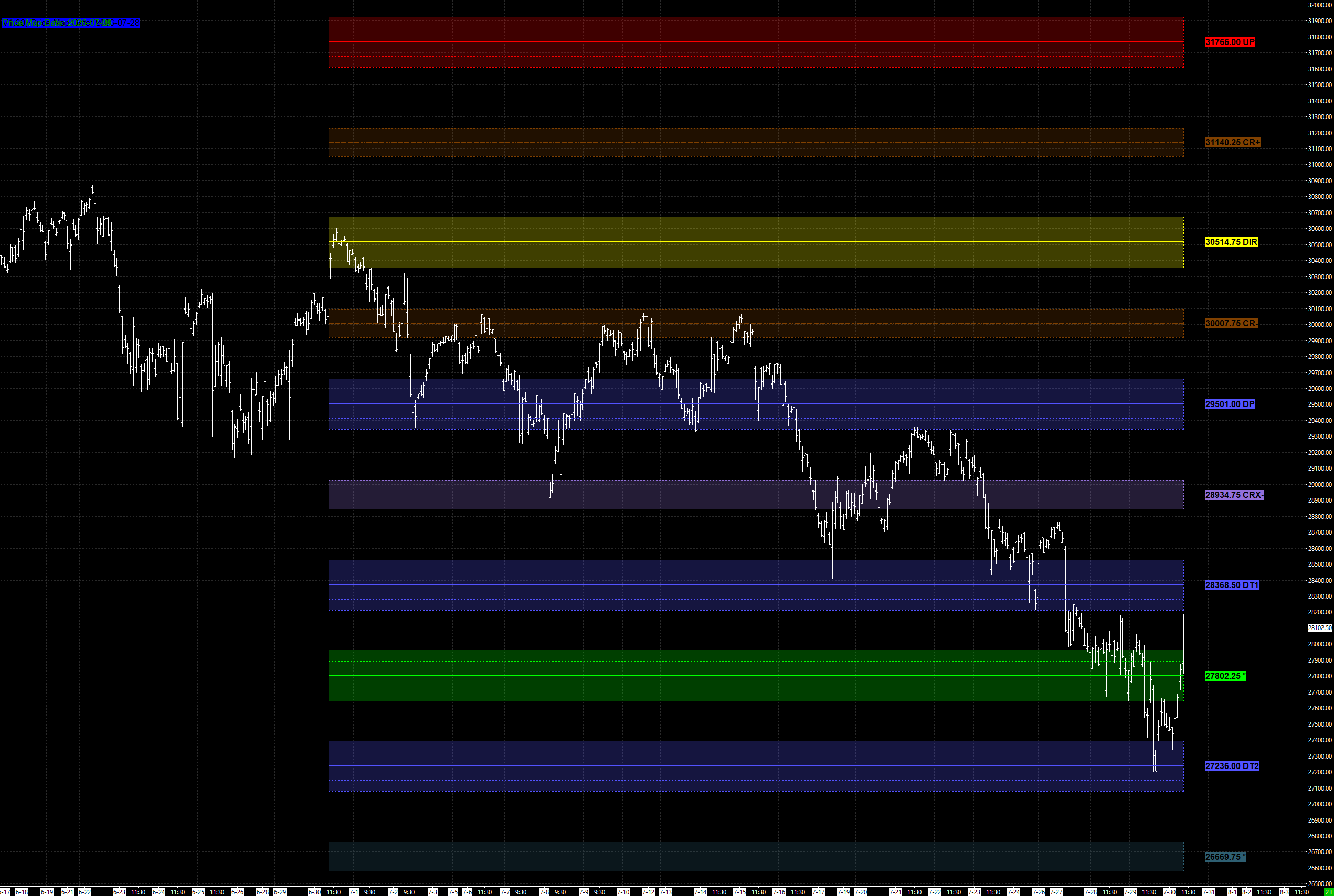
Now the full map. Above and below the Critical Range sit the breakout and target levels — the outer structure price travels to once it leaves the neutral zone. The point isn't to memorize the labels. The point is that these levels are not arbitrary lines. They are a measured ladder — defined levels the market steps through, not random lines. That measured ladder is the key to everything that follows.
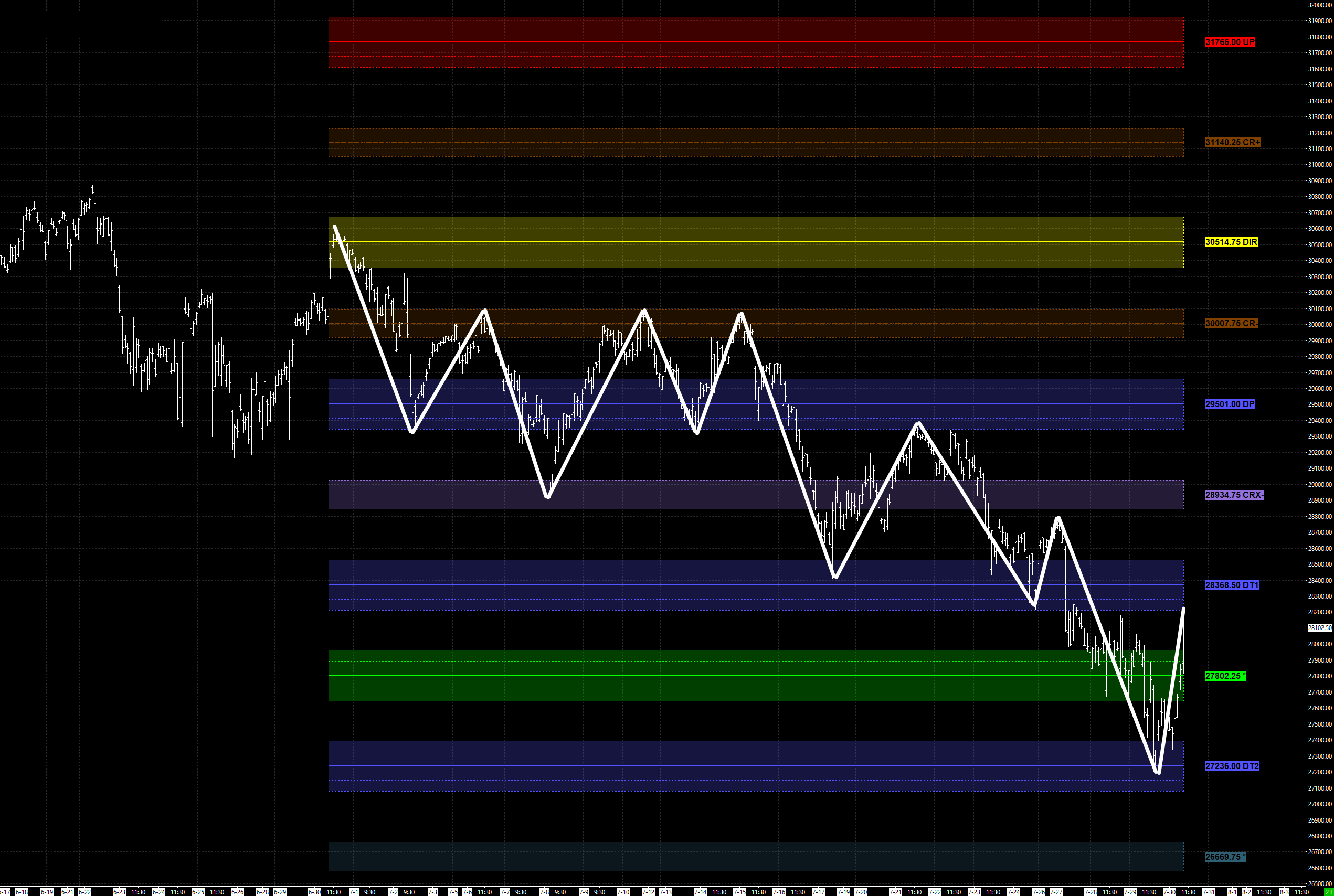
The white lines highlight the swings — the impulse legs the market actually travels in. Drawn in, the behavior is obvious: price does not drift level to level at random. It moves in segments — an impulse (the swing), a pause to digest, then the next. Seeing the swings is what lets you stop reacting to every bar and start reading the move. The only question left is: how big is a segment supposed to be?
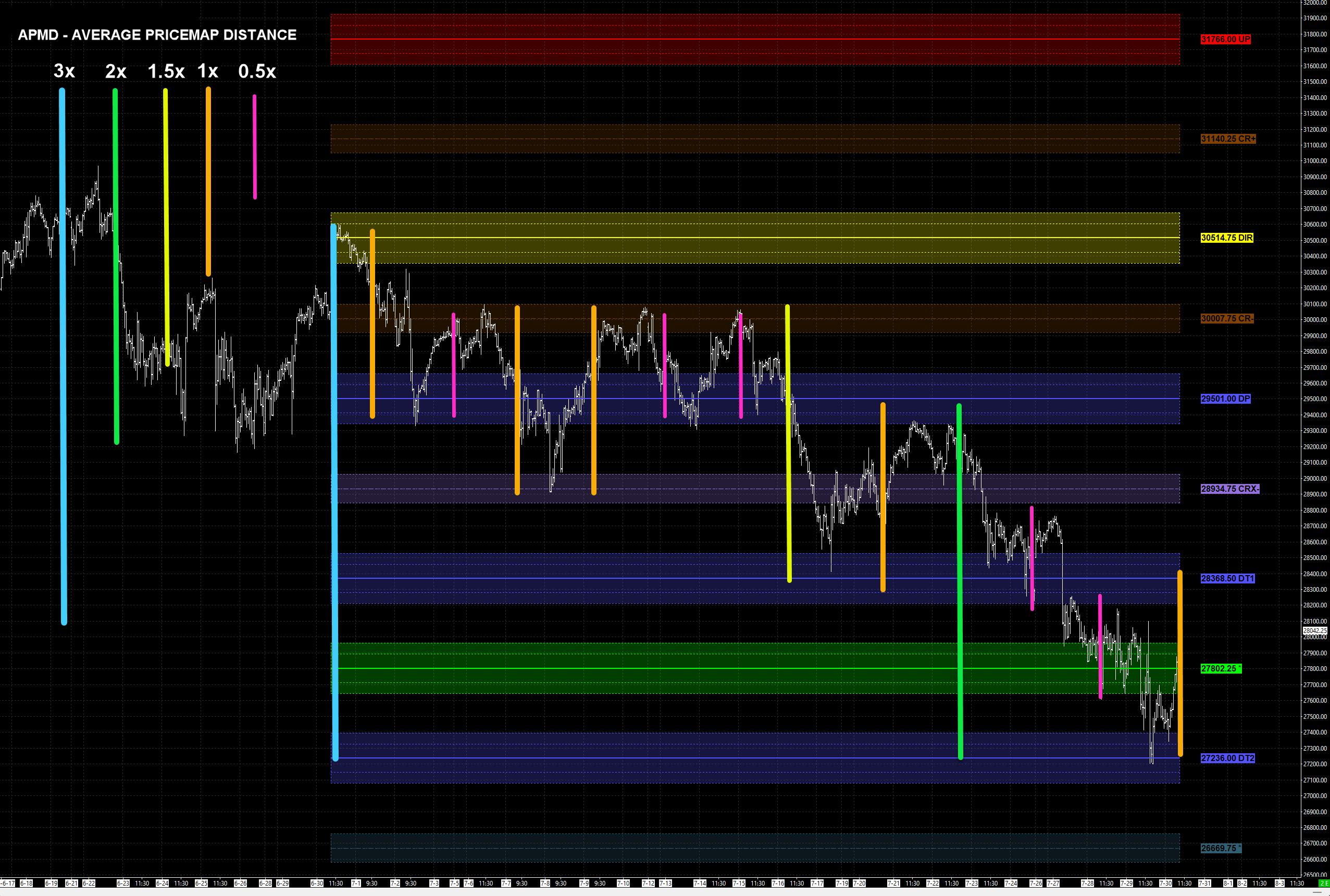
This is the answer. APMD — Average PriceMap Distance — is the average distance between the major PriceMap levels. It is the movement denominator of the framework: instead of measuring a move in points or dollars — which mean nothing across markets, since a 500-point move in one instrument is not a 500-point move in another — you measure it in APMD. One APMD is the average distance between the major PriceMap levels — one segment-sized step through the structure. Measure a move in APMD instead of raw points, and every move on every chart becomes comparable.
Markets travel in recognizable segment sizes: 0.5x, 1x, 1.5x, 2x, and 3x APMD — with the occasional 5x–7x event move. That's the vocabulary. When you know the size of a segment, you know what a normal move looks like before it happens.
One rule keeps this honest. APMD sets the expectation — how far a segment should travel. It does not force the move to stop, and it does not cap it. Whether a segment keeps going is a structure question, not an APMD one. And the context — the market's State and risk Regime, the Market Structure Bias — handicaps the odds: which segment size is likely, and how long it should take to play out. APMD measures the distance. Structure decides the behavior. Context sets the odds.
The single most useful read is where price sits relative to the Critical Range:
0.5x → 1x APMD segments, occasional 1.5x–2x. Rotational. Fade-friendly. Compressed.
Outside the Critical Range
Propensity to expand — minimum 1x, a 2x expectation, 3x best case.
Inside the neutral zone, expect compression — small segments, chop, false breaks. Once price leaves the Critical Range, the propensity shifts to expansion. Not a guarantee — a propensity. But that shift is the tell that a bigger segment is on the table, and it changes how you size the opportunity.
An expected segment size is an objective — and an objective, defined before you allocate capital, is Trade Vision. It changes everything downstream. With an objective, risk stops being a guess: you can define the risk required to capture the reward, structurally, and know whether the trade is worth taking at all. And it drives management, because the segment expectation tells you where the move is likely to pause. You are no longer hoping. You are operating against a benchmark.
Here is what that looks like on a real move from this same chart set.
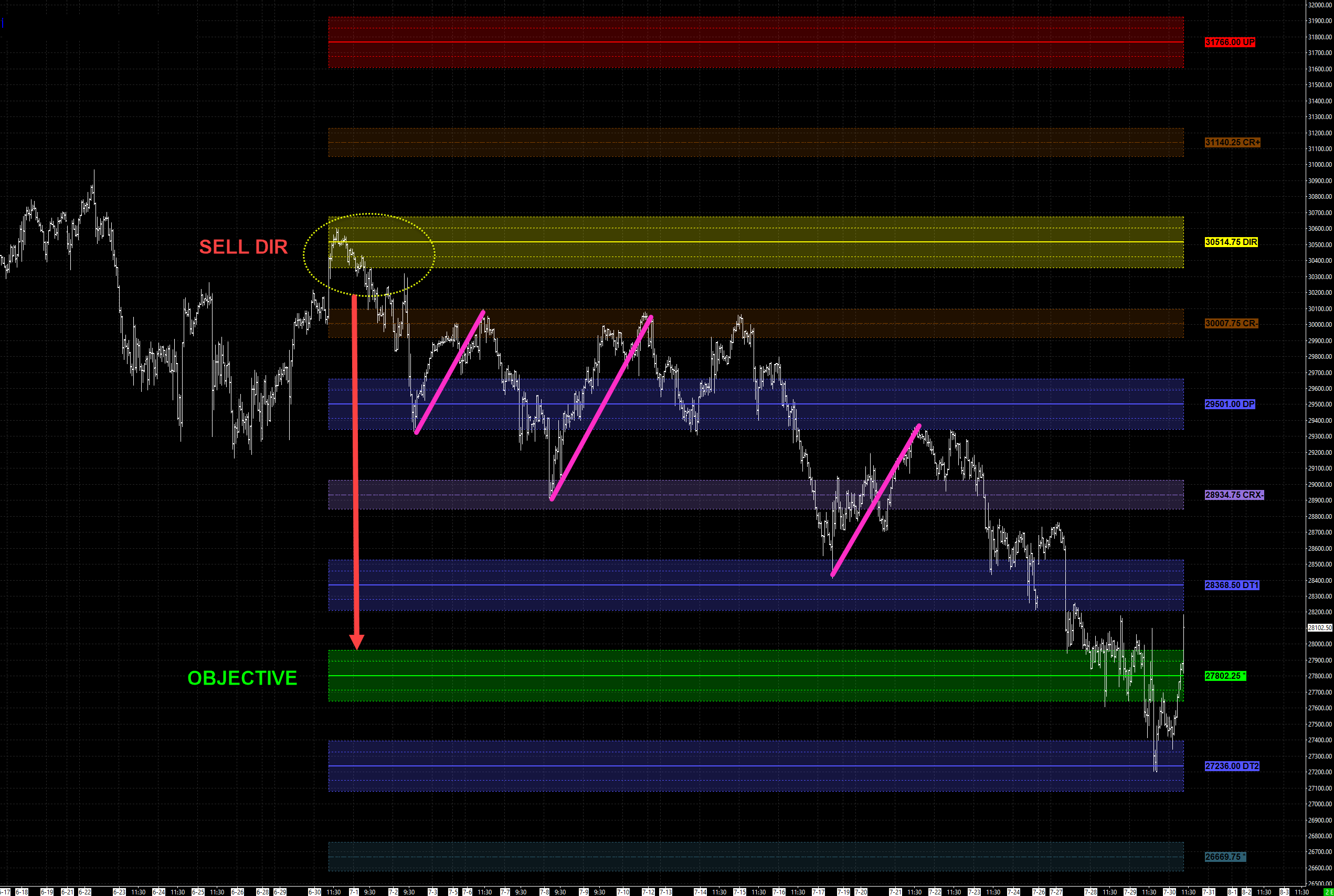
A SELL DIR entry off the 30514 DIR — price rejecting the Directional Level with a negative expectation — sets the objective at the R-Level, 27802. That objective, defined before a dollar is committed, is the trade vision. And the structure delivered it: roughly 3x APMD to the objective.
Here is the part that separates calm operators from emotional ones. That trade did not travel in a straight line — and that is the whole lesson. On the way to the objective it handed back 0.5x and then 1x APMD in counter-rallies — the swings up against the position, marked on the chart. Each gave back the unrealized gain of the leg before it. Neither broke the trade vision. That is not the trade failing. That is normal ebb and flow inside a trend.
The emotional trader does the opposite of what the structure asks. They press size into the impulse while the PnL is green, chase their entry average up with the move, and get shaken out on the first 0.5x give-back — a good trade turned into a scratch, or a loss. Worse, the move then follows through to the objective it was always going to reach — the full 3x — without them on board. Right idea, wrong management. That is what breeds the anger and the defeat that ends trading careers.
The operator with Trade Vision reads the same bar completely differently. They saw the segment framework before the entry. They know a pause after a half-segment is normal. So they decide from a fact foundation: accept the give-back as the cost of holding for the objective, or lock in a percentage of the unrealized gain — and which one is governed by the opportunity (Trade Vision) and the context (State and Regime). That is calm clarity in the moment: observing price action within market structure, in the context of the underlying state and risk regime. It is the opposite of managing a P&L number up and down on emotion.
Because APMD is a denominator, it normalizes. The segment expectation is the same on the NQ monthly, on a crypto perpetual, on a currency pair, on a daily or a quarterly. Same 0.5x, 1x, 2x language. Same read. That means the method is not a feel you develop for one instrument — it is a fact foundation you can run discretionary, or hand to a systematic bot, and get the same objective read of what the market wants to do.
That is the power. Not a prediction — a baseline. Price moves in segments, the PriceMap measures them, and the operator who reads the segment before allocating capital keeps more of what the move gives and gives back less of what it takes.
APMD is part of the PriceMap — the measure of the segment distance between its levels. See how the full structural overlay is built — every level, every market, every timeframe — on the PriceMap page →